Thursday, July 21, 2016

Final Post


     For my final post I'm choosing my two best photographs. The first picture was during my trip to the Galapagos Islands and Ecuador. We were riding on a water Taxi to get to the beach from the boat. I just put down my camera to take a picture for fun and it turned out amazingly well. The lighting in the picture is side light as I'm taking the picture in the shadow cast from the boat. The closeup on the boat creates an extensive depth field that show boats and tress in the background. The focus on the water in the foreground makes the texture of the water look cool.

     The second picture is from I hike I took in Muir Woods just outside of San Fransisco. It was in the morning and we were walking through a dark section of the forest. I thought the green grass and the trees lined up into the fog created a mysterious and ominous tone that was just really cool to look at. The lines of the trees also help to make the photo dramatic.

     I think this class has helped me grow as a photographer because I've become more thoughtful about my photographs. I've learned about different techniques that ca make my artwork more unique, gotten more familiar with adobe photoshop, and have had a great time. In the future I just want to keep having fun as a photographer. I hope to capture moments and landscapes that will make people smile.

Wednesday, July 20, 2016

Water Color Portrait

     For my water color portrait project I chose to use a picture of me golfing. Golfing is a passion of mine that I really enjoy. This project entailed a long list of instructions that I had to follow meticulously. First I had to increase the contrast and the brightness of the image to eliminate grey tones. After I edited the original photograph I had to create to versions of the picture. One that had a high threshold and another that had a watercolor filter. After doing this I merged the two layers along with watercolor to create this image.

     At first I struggled with the merging but after a while I realized I needed to clean up the image and erase all of these stray gray marks. If I were to improve on my project for next time I would make sure to use a picture that wasn't so pixelated. Believe it or not the final project would've come out even better than it did. Overall I think the project was a success. The artwork turned out great and I had fun working on it.


Selfie vs. Self Portrait

     For my Selfie vs. Self Portrait project I choose to take two pictures of my phone showing two completely different activities. In the photographs themselves I chose to use front light to illuminate my hand coupled with the glowing light from my phone. The lamp which I used as front light emphasized the phone and my hand. The photo is shot with a shallow depth of field for a close up on the phone. Additionally the pictures are high key, meaning their are a lot of light tones.
   
     But there is a significant difference between a selfie and a self portrait. A selfie depicts what you want people to think of you. A self portrait depicts what you think about yourself. For my self portrait I choose to do a picture of me playing Pokemon Go. Although I don't see myself as only someone who plays Pokemon Go but I think it represents my love for doing fun things that might be goofy or childish. My selfie depicted me reading the New York Times. Although its not always true people think I'm very intelligent, especially during the school year. It's not that I'm a teachers pet or I'm a genius, I just seem to do well at times when people are watching so they don't see me when I struggle. Even though these pictures aren't amazingly artistic I think they in some way really represent my life and my interests.

Tuesday, July 19, 2016

Hawaii picture


     I captured this photograph while waiting for dinner one night. I was walking around the area with my cousin and little sister when I saw these very interesting looking plants. I also saw the calm water and the dim sunset so I thought it would make a great picture. I experimented with the depth of field to come up with this photo. The focus is on the plants but the amazing landscape fills up the window.

Monday, July 18, 2016

Shadow, Pattern, Reflection project


     I really enjoyed doing this project. I had a lot of fun staging the picture and working with the lighting. The subject matter I chose was Dunder Mifflin Paper company from the show the Office. There isn't a specific reason why I chose it, but it's my favorite show and it occasionally pops into my head. While we were shooting we found that the iPhone flashlight worked a lot better than the lamp for the shadow effect even though I still really liked how the lamp photos turned out. I think this was a very basic shadow project and I could improve by taking on more of a challenge. But overall I think the project was a real success. The pictures turned out great and I had fun.


Independence


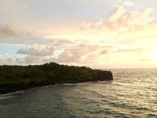
     I took this picture of a Hawaiian sunrise at five o'clock in the morning. That night we had camped out in Hana, the remote part of the island at this beach. Since we were in tents we woke up super early because of the light. But I think this picture shows freedom and independence because its inspiring and it makes me feel like I can do anything.

Friday, July 1, 2016

looking down


     Looking Down: I took this picture of a small plant in my back yard. I thought that the off center growth of the plant would look interesting in a picture from above. I also tried to follow the rule of thirds as best I could by placing the green part in the bottom right section. I think it turned out really really well.